BlueGorillaStudio

BlueGorillaStudio:

Portfolio Case Studies

UX Case Studies:

-focus on the entire user journey-from concept to completion . . .

First Notice of Loss (FNOL) Re-Imagined

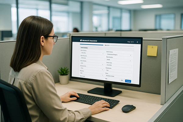
Imagine you are on the phone with a policyholder, trying to report a new claim quickly and accurately. But as you move through the FNOL application, you are met with a maze of forms, repetitive fields, and no clear sense of how far you have progressed. You are constantly second-guessing—“Am I almost done? Did I miss a step?”—all while the clock is ticking and the caller grows impatient.

That is exactly what claims intake specialists were facing every day. From a UX perspective, I saw this was not just an inefficient system, it was adding stress to an already sensitive task and increasing the risk of errors at the worst possible time.

This project was an exploration into re-imagining an existing application. It served as an exercise in creative problem-solving and envisioning future possibilities. The work served as a conceptual approach to guide future improvements, capturing my latest iteration rather than a final solution.

The Challenge

Users of our First Notice of Loss (FNOL) application were frustrated. Reporting a new claim felt clunky, with a complex entry process, and no clear visual sense of progress to reassure users how far they had come or how close they were to completion, adding confusion and stress during an already sensitive task.

They wanted a smoother experience, better system integration, more visual guidance, and interfaces that worked the way they worked.

The challenge was clear. The application needed to be transparent, supportive, and clearly guide users through each step to reduce frustration and provide reassurance when it matters most.

FNOL Re-Imagined

What is FNOL?

First Notice of Loss (FNOL) is the initial report made by a policyholder to their insurance company, notifying them of an incident or event that may lead to a claim. This notification typically includes essential details about the incident, such as the date, time, location, and nature of the loss or damage, as well as information about any involved parties and witnesses. FNOL is the first step in the claims process, initiating the insurer's response and investigation into the reported event.

Key insights

  • Simplification: users expressed a clear need for improvements in various aspects of the system, with a primary focus on streamlining the entry process.
  • Inefficiency: manual and repetitive processes increase the risk of errors and consume significant time, leading to frustration and inefficiency.
  • System Limitations: outdated, non-intuitive interfaces and poor integration with other systems (e.g., File note, Insights, policy databases) slow down the workflow and disrupt seamless operations.
  • Compliance and Regulations: difficulty adapting to new rules to ensure compliance with ever-changing regulations.

Areas for improvements

  • Enhanced User Interface: modern, intuitive interfaces that streamline navigation and reduce the learning curve for new users.
  • Automation and AI Integration: automating routine tasks and integrating AI to assist with data entry and initial claim assessments.
  • Seamless Integration: better integration with other systems to create a unified workflow and reduce the need for redundant data entry.
  • Customization and Flexibility: allow users to customize workflows and dashboards to better suit their specific needs and preferences.

Tools

Figma, HTML, CSS, JavaScript

Approach

The goal was to streamline the FNOL process, improving both efficiency and user experience. A comprehensive UX design process was followed, including in-depth research, persona development, user journey mapping, design, and prototyping. Changes were introduced thoughtfully to align with existing user expectations while ensuring a practical, user-centered solution for the insurance software landscape.

Research

Through qualitative interviews, quantitative analytics, and surveys the goal was to gain valuable insights from key stakeholders and users, ensuring a wide range of perspectives.

User Personas

Using a combination of qualitative and quantitative research—including interviews, surveys, analytics, and user testing—key personas were developed to guide the design process. The initial focus is on a primary, aggregated persona for the MVP, with secondary personas planned for future iterations. These personas reflect the core traits and needs of a Claims Intake Specialist, ensuring a user-centered approach to the design.

Emily Johnson represents the core characteristics of a Claims Intake Specialist, with a strong focus on empathy, efficiency, and problem-solving. Her role revolves around streamlining the claims process while delivering compassionate support to policyholders.

View Full Size Persona

Persona example for FNOL 3.0

Journey Map

Using insights from qualitative and quantitative research—such as interviews, surveys, and user testing—the claims intake journey map was developed to visualize the step-by-step process that Claims Intake Specialists, like Emily Johnson, follow when managing auto collision claims. This basic journey map outlines each phase of the process, capturing both the pain points and emotional journey experienced.

By identifying inefficiencies and emotional challenges, the journey map helps drive UX improvements, ensuring a smoother, more efficient workflow that enhances both employee experience and claimant satisfaction.

View Full Size Journey Map

Journey map example for FNOL 3.0

Design & Prototyping

Key modernizations:

  • Added an improved, intuitive progress bar with textual, visual, and accessibility cues, allowing forward and backward navigation to accommodate non-linear information flow.
  • Implemented form fields following best UX practices to enhance accessibility, eliminate unnecessary and optional fields, and reduce cognitive load and errors through AI-driven preloaded values and autocomplete.
  • Maintained a single-column format for uninterrupted vertical flow, logical field sequences, and explicit names and labels.
  • Utilized brand colors within a Material Design color scheme, highlighted active fields with border color changes, and animated the submit button upon hover for clear user feedback.
  • Used effective whitespace around form elements to prevent overcrowding, making the form cleaner, easier to read, and helping users' eyes rest while distinguishing between sections.
  • Reduced psychological friction by breaking long forms into smaller steps and visually grouping related labels and fields to make the process feel less overwhelming.

Usability Testing

TBD

Outcomes

TBD

File Notes Enhancements

Imagine you are deep in your work, handling an insurance claim, when you realize you need to add a critical note. But instead of quickly jotting it down, you have to stop what you’re doing, navigate away from your workflow, and open a separate page. Now, you’re stuck juggling multiple tabs, losing focus—frustrating, right?

That is exactly what claims professionals were facing every day. As a UX specialist, I saw this was not just an inconvenience, it was actively slowing them down and risking lost information.

The Challenge

Our challenge was to redesign one of the most-used features in the system without disrupting what users were familiar with. Users depended on it, but it forced them into inefficient workarounds, jumping between screens, keeping multiple windows open, or even resorting to third-party tools.

The process was slow, confusing, and frustrating. Users wanted something faster, simpler, customizable, and more practical—an intuitive solution that worked within their real-life workflow.

File Notes Enhancements

What are File Notes?

File Notes are detailed records maintained by claims professionals during the insurance claims process, documenting communications, actions taken, decisions made, and updates about the claim's progress. These notes typically include critical information such as policyholder interactions, conversations with involved parties or witnesses, investigative findings, claim evaluations, and rationale for settlement decisions. File Notes serve as an essential audit trail, ensuring transparency, consistency, and compliance throughout the claims handling process.

What we learned

  • Simplification: users expressed a clear need for improvements in various aspects of the system, with a primary focus on streamlining the entry process.
  • Inefficiency: the current process proved to be time consuming, inefficient, and fatiguing, requiring users to navigate back to the File Notes page each time they wanted to add new notes for a claim.
  • Workflow Disruption: the necessity to shift from their current work page to the File Notes page was disrupting the seamless flow of claims management for users.
  • Confusion: users encountered additional confusion when attempting to self-solve these challenges by resorting to the practice of opening new tabs or windows for each claim to input notes.

Approach

The primary goal was to enhance the accessibility of the File Notes system across the entire claim life cycle, ensuring practical use for real-world scenarios. This approach followed the key stages of the UX design process, starting with in-depth research, persona development, journey mapping, and progressing through design, prototyping, and usability testing. Given the familiarity of the feature to users, careful consideration was taken to introduce changes aligned with user expectations while maintaining ease of use.

Research

A combination of qualitative interviews and surveys was used to gather valuable insights from key stakeholders and users, ensuring diverse perspectives were captured. The feedback and support requests provided a thorough understanding of user pain points and challenges, further enhanced by interviews with professionals experienced in insurance and claims handling. By organizing the findings into themes and trends, a holistic view of user needs and preferences was formed, guiding the project toward a more user-centered solution.

Personas & The User Journey

User personas were created based on research and interview insights to guide the design process. A primary persona was developed for the MVP, capturing key characteristics and needs, while secondary personas were identified to address other user segments in future iterations.

The journey map then provided a visual guide to the file note process, taking into account essential factors such as the line of business, user roles, and the current stage in a claim’s life cycle. This helped create a clearer understanding of how users interact with the system and shaped the design to better support their workflow.

Design & Prototyping

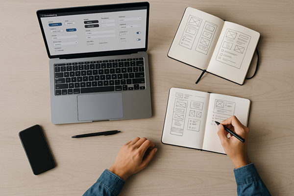
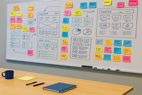
The design process began with brainstorming sessions, where ideas were sketched out and user flows were mapped. Key user needs emerged, including ensuring File Notes were accessible without leaving their current task and accessible across workflows, removing the need to open multiple windows, and offering a dynamic, resizable interface.

The goal was to create an easy-to-use, familiar, and flexible interface that minimized friction for users. Lo-Fi wireframes were iteratively refined, and discussions with engineering ensured alignment on platform requirements, technology constraints, and feasibility.

Usability Testing

Usability testing began after the initial designs and prototypes were ready. Internal users explored low-fidelity wireframes, providing valuable feedback that led to improvements and the development of a working HTML prototype. This prototype evolved through multiple iterations, with each round of testing addressing engineering concerns and refining the design. Continuous feedback helped resolve any issues, ensuring a more polished and user-friendly experience.

Outcomes

The redesigned File Notes system was successfully launched, seamlessly integrating across all pages and workflows. The new floating interface allowed users to continue their tasks while interacting with File Notes, offering flexibility with a moveable, resizable design that adapts to individual work styles. This innovative solution significantly boosted user performance, improving satisfaction and proving to be a major success with clients. The enhanced features were well-received and made a tangible impact on workflow efficiency.

Fuze Design System

Creating a consistent experience across multiple applications with an improved design system.

The Challenge

The primary challenge was addressing critical issues that impacted the user experience for both internal and external users. Additionally, maintaining brand consistency and improving the efficiency of the product life cycle were key hurdles that needed to be overcome.

Fuze Design System Screenshot

Key takeaways

  • Consistency: existing products each had a distinct look and feel. Inconsistencies were common across products, sometimes even within the same application causing confusion and a disruptive user experience.
  • Efficiency: the absence of standardized design/coding patterns, predefined components, or guidelines for developers to follow resulted in inefficiencies. From a product development life cycle, this led to redundant efforts for each new project, a lack of a common design direction, prolonged iterations, and delayed updates. Overall, this hampered the general agility in the product life cycle.
  • Brand identity and user trust: the lack of a cohesive look and feel across products contributed to diminishing our brand identity and hurting the connection users had with our product.
  • Scalability: the absence of a structured approach to the UX/UI increased the difficulties in scaling our products and adapting to the future needs of our users.

Approach

To address critical user experience challenges, a clear approach was outlined. This started with in-depth research, followed by stages of design, prototyping, and user testing. The goal was to deliver a comprehensive and user-centered solution that improved both internal and external experiences.

Research

The research phase involved a detailed review of all applications to identify recurring components shared across them. The focus was on standardizing these elements to create a more cohesive user experience. Heuristic evaluations were also conducted to ensure consistency in typography, iconography, and color patterns, establishing a unified visual language.

Design & Prototyping

Collaborating with designers, an extensive icon library and coding patterns were developed to ensure seamless implementation. Themes based on CSS color patterns were also crafted to enable future updates. Flexible layouts were introduced to accommodate different screen sizes, and reusable coding patterns were implemented to enhance efficiency. A working HTML prototype was developed to test, iterate, and refine designs without affecting the core application.

Usability Testing

Usability testing was conducted first internally, then with external users, to validate the design system's consistency and accessibility. These tests focused on ease of implementation and clarity of coding patterns and layouts, ensuring that the system addressed the needs of both developers and end users.

Outcomes

The new UX design system significantly improved user experience and workflow efficiency. The creation of a layered CSS structure, standard fonts, icons, and behaviors contributed to consistency across products. Written and visual guidelines empowered developers, while a flexible testing environment streamlined the integration of new UI features. The improvements enhanced scalability, user confidence, and brand identity, earning positive feedback from both customers and developers. The prototype remains a valuable tool for training new developers and testing customizations.